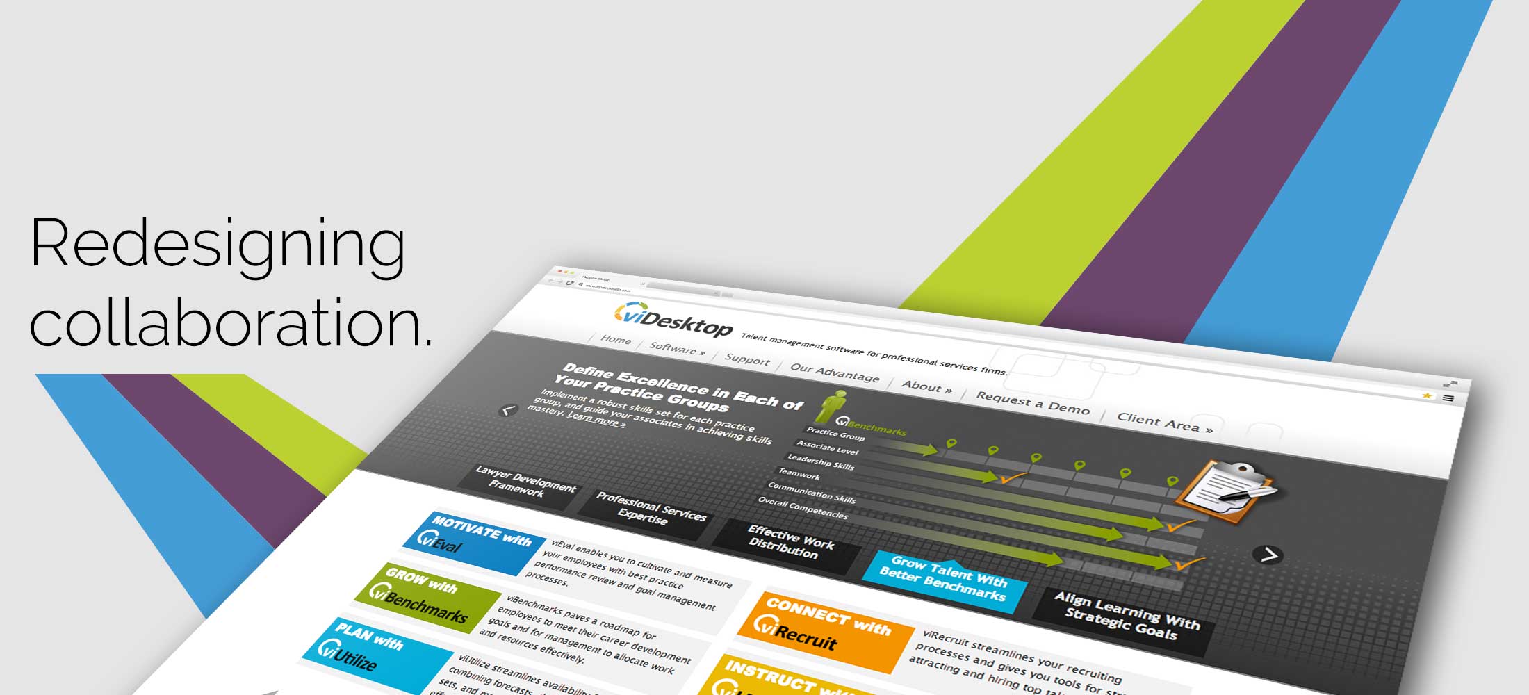


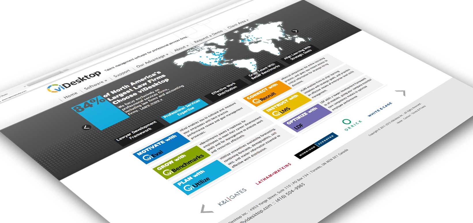
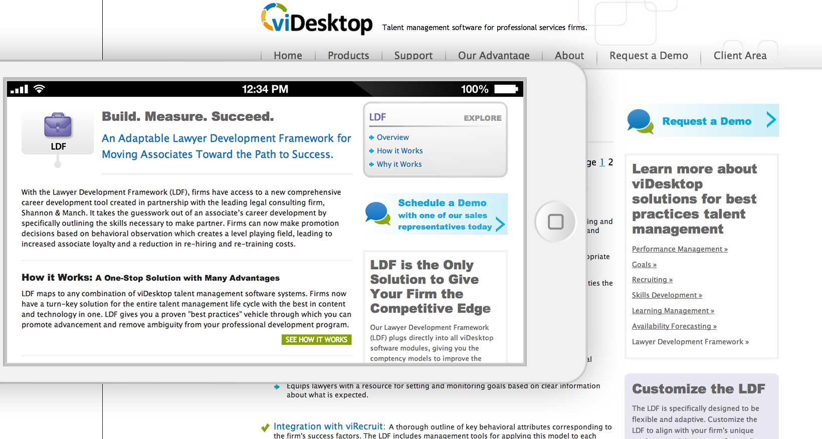
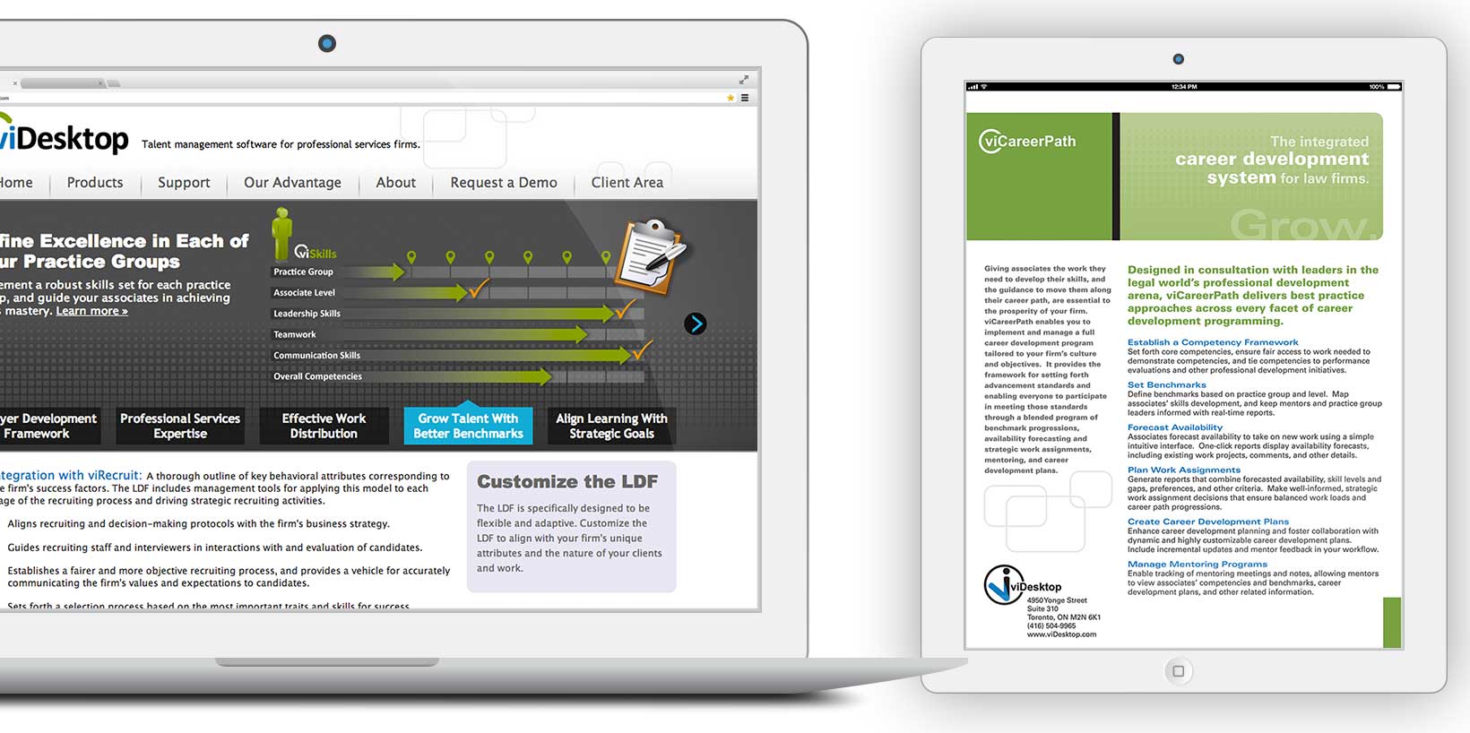
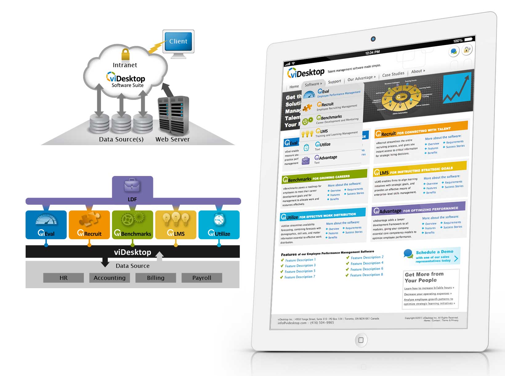
For software companies, adding new features to their app is imperative to stay competitive and meet demanding user needs. As the leading talent management software choice for legal and professional services firms, viDesktop’s rapid release schedule of innovative features and updates meant they needed a UI redesign and a fresh strategy on UX.
Rapture Studio was hired to redesign the app’s user interface, refine the user experience to improve usability, promote their new features by making them more intuitive and user friendly, help new customers find their software, and give their sales teams new tools to convert leads.
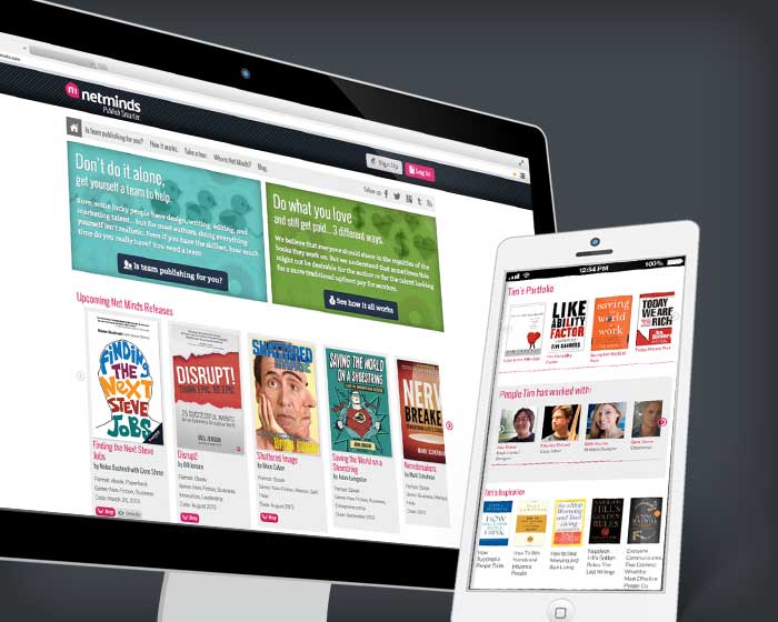
Rapture Studio designed and developed a unique user interface for the Net Minds app. We also designed and developed a new website and content management system.
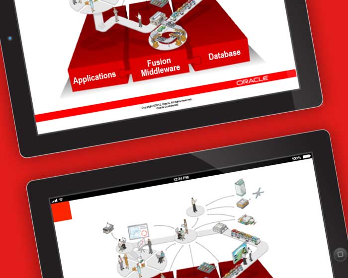
Oracle hired Rapture Studio to design and develop a customized Intranet user interface design, a new PowerPoint presentation system, and marketing assets.
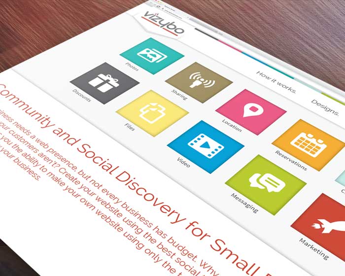
Rapture designed and developed a new community/social marketing app, developed the user experience, designed a unique user interface and a clean, techie brand.
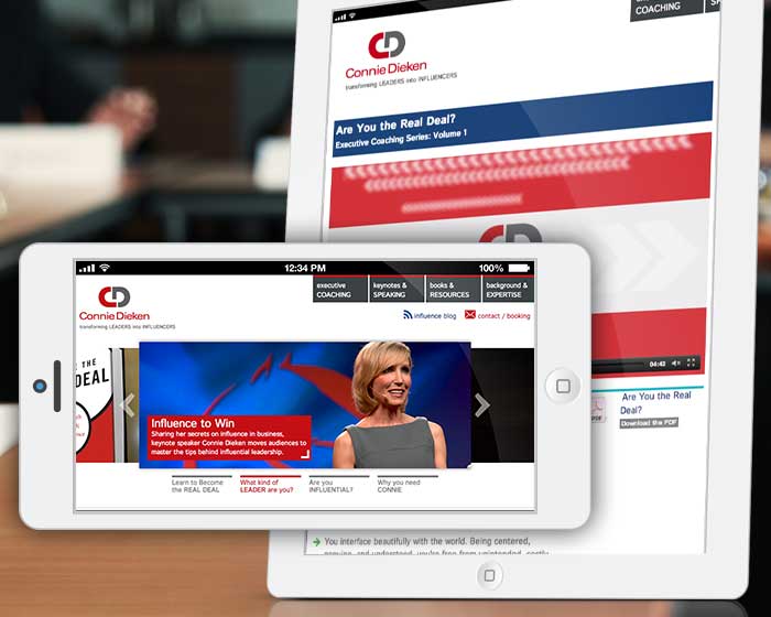
Rapture Studio designed and developed a new website and online brand for Connie, built for streamlined service offerings and social marketing.